although on the surface the story is a description of events - the gentleman caller, the gift, the dance and then the exit - I was missing the emotion and feeling tied with the words... The female character is very much line a pin up girl, in that she is an object of affection and desire... wanted by men and envied for her looks. She has mistaken the male characters obsession for love and the gloves as signs of affection but whilst giving one last performance, comes to realise her error and breaks down in tears. Then to clarify his intentions are purely selfish, the male character leaves instead of comforting her...
I was originally looking at this from more of an erotic tease point of view, where the interest is in the mystery but I too have made a mistake whilst reading. The story now appears more sinister... some of the metaphors used towards the end are a little darker... as the woman breaks down in tears, it is described as a leaving a crime scene... the male character has no more sympathy for her and has already gotten what he wanted so he leaves silently...
I had already started diggin up some film noir reference, but i found it was more modern day interpretations of the noir style that i preferred...
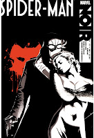
Marvel's NOIR series.. (various covers from Wolverine, Spiderman, Luke Cage and Daredevil and a few pages)... I was looking mainly at the use of a limited colour palette... using black and white and then one spot colour can draw attention to more narrative details and place other non-necessary details to the back..
Sin City: because of the limited colour scheme, it immediately reminded me of Sin City (both the comic and the movie)... some of the frames/panels are influenced by the film noir style in the way that they use perspective and foreground and background imagery... Lighting helps add to the atmosphere as well as draw attention to specific details... (e.g. the cuts on Hartigans forehead)
Film Noir: Obviously, rather than just look at things made in the style of... I have only scratched the surface with looking into film noir... as I listed above, the lighting (shadows and highlights) helps create a specific mood... shadows are used to suggest information that may be off screen but also add to the composition...
100 Bullets: Again, another bunch of comic covers, but a lot of these I have chosen due to the either technique or the narrative contained within the composition... e.g. the skull in the wine glass... (could be blood?) the gun suggests murder. or the hangman's noose placed over the kidnapped character tied to a chair... In terms of technique... I was looking at the screen print styled offsetting of colour and line, as well as limited colour palettes....
Chesterfield & Devan: To help aid my compositions, I started looking at other "bits" I could add in the background to help tell the story or set the scene... for example here are varying styles of chesterfield armchairs and a couple of devan sofas...
Dress: Similarly to looking at furniture, I wanted to try build up a picture of the female character (as I will probably use her primarily in my compositons). the paisley dress descrition doesnt give me much information but looking at 1930's "vintage" could help with my design, but I'm currently thinking more along the lines of silhouetting out unimportant details..
marlboro menthols
Silhouetting.... to be continued.....


.jpg)


.jpg)


No comments:
Post a Comment