Showing posts with label work. Show all posts

Monday, 16 May 2011

LoveCream collective

A few of us in the studio finally pulled our finger out and put a newspaper together... using the NewspaperClub for the printing.. we just decided to go for it and see what happens. The actual copy has changed a fair bit from what I always imagined it would be but at the same time, this is a good thing as I get too attached to my own ideas and they become a little stale.. when others and introduced it means something different can happen and I'm normally pleasantly surprised...

anyway.. i feel i need to explain my decision on the images I created... firstly.. in what started as a joke.. we were all having a meeting and throwing ideas around about what the general theme could be... someone suggested Kurt Russell and for some reason it just kind of stuck.. I wanted to originally produce a sort of catalogue of our best work that could be mailed out to agencies but the idea behind our magazine just started getting more and more twisted... we started trying to create some sort of backstory to why we were doing an issue on Kurt Russell and we created the idea that we were all fan crazed stalkers of Kurt Russell.. and that we could literally take the images as far as we want.. after all it wasnt strictly for the course..

.. my first idea was to create a playful mask that you could cut out and wear in hopes of becoming ever so slightly like our hero Kurt... sadly.. on the paper it was printed...if you cut it out it may be a little too flimsy...


in all honesty... because I needed to make up another page, I came up with the idea of a set of accessories that you could cut out and decorate the mask on the front cover with them.... i created the moustache from Tombstone (Wyatt Earp), the furry collar from the Thing, the scar and cigarette from Death Proof and the eye patch from Escape from New York.... in the same way to the mask.. the paper is a little too thin to cut out properly but also the scaling seems to be off a little... oh well..


finally here is the odd one.. I thought if we were meant to be mad obsessed fans then what would a crazy person do? i then involved the mask off of the cover too.. ;) if you have a sense of humour then you'll find it funny.. otherwise.. go cry somewhere else...


we also added our own title to the piece...rather than just having plain type we each designed 2 letters.. here are mine.. i thought i'd try capture my love of comics and the slime one would be a slight hint to the name ... ;P


Sunday, 15 May 2011

Editorial project... FMP

OK.. so this last few weeks has been absolute murder for me... basically in choosing a final major project to do.. i thought it would be wise for me to do something that would boost my portfolio ready for going into the wide world of illustration.. so.. i decided to do some editorials. I wish i didnt! ahaahah

working in the LOVE studio did some what distract me from my work, I found it more enjoyable to work on something that was LIVE and could go into print rather than on some ficitional projects. but saying that, I have enjoyed creating the images.. but Im not happy with the final outcome in terms of the colours.. but before I get to that.... let me start from the beginning.

I firstly decided some articles from New Scientist, T3 or Wired magazine would best suit me as the articles would at least be interesting enough to work on and also appeal to my interests in science and technology.. in the end I went with 6 articles from Wired magazine looking at...

'Discovering new species'
'Capturing Solar energy'
'Getting people to do as you want'
'Entomological terrorism'
'Work induced stress'
and finally...
'Chillwave: a new genre of music'

i found coming up with ideas rather easy but i just couldnt settle on which one to choose for each article. and even when I did I was never happy with the outcome I had chosen.. different ways of doing things always crossed my mind... anyway.. i started producing a series of images just to get some feedback...

Slowly these developed more and more and I decided that i would hand draw them rather than digitally vector them, but dont think I didnt spend time making them in illustrator too... eventually i had to just choose and I was in love with the idea that I could hand draw everything.. i was using tracing paper and pencil.. but this then drove me mad.. instead I switched to a light box and uni ball pens.. much better.. and if I made a mistake then I treated it exactly like how Marc McKee did and I used correction fluid.

Because I wasnt in the studio at the college, I wasnt receiving regular pointers on if I was heading in the right direction so I had to just trust my gut and go with what I thought was the right idea for the job...

sadly as time was running out.. i then had a tutorial and I had to re-jig my 5 out of 6 of my designs... the 1 design they did like was more animated, the humour was there and it very much like a cartoon.. where as the other designs suddenly looked too realistic in comparison... so I ended up re drawing a LOT of elements.. then having drawn them to how I liked.. i had to ink them.... all rather time consuming.. but having to add colour to them was the worst part yet. I nearly gave up numerous times, crying about if it was all worth it and if I should just colour them how I wanted instead of taking swatches from skateboard stickers and applying them to the artwork... I was a little dubious at first.. but then I realised that a lot of the stickers featured similar colour trends.. so I ended up limiting my palette to a choice of approx 6 colours throughout the whole set....

I'm glad I made the changes that I did as I feel the ideas have progressed.. but I'm worried that when not under the guidance and supervision of the tutors.. can I do this on my own? hence another reason why i want to work in a collective and around like minded people..

Hunter: this was the first image I actually started... the idea was about discovering new species and the ways in which you can go about this... immediately the typical ideas jump to mind.. a british safari/game hunter in khaki and a pith hat.. which I actually decided wasnt a bad idea.. but the main focus was new species.. i thought to myself.. rather than trying to imagine a new species of animal or insect.. I could distort the hunter character so much so that he actually became the new species himself... i began giving him more limbs.. and then later more eyes.. but I had to ask myself.. was some of the alterations necessary? for example.. the 3 eyes to the character.. does he need to look like a spider? or can the extra limbs signify that he is a new species alone?


my final piece in a mocked up context.


Bugs: this image started out as my favourite.. i thought the idea of depicting insects as terrorists was a funny idea... maybe so much so that people wouldnt be able to look at a common house fly in the same way anymore.. but as the sketches developed I found the bugs becoming plainer and less unique.. almost like i was drawing them too accurately again. I still love the idea of these guys but I feel like I could have distorted the characters bodies more in order to emphasize their qualities.. I also dislike the background i had originally made for them and the one currently in use with them.. where as I wanted some sort of marker in there to show scale. it just didnt work...


Zombies: Getting people to do what you want is no easy task, but I wanted to go down what I thought was a less travelled route.. instead of mindless zombies.. i wanted to represent the general public/ audience as puppets.. controlled by strings by an invisible puppeteer. it turns out I had it the other way round.. the puppet idea was over done and zombies less so.. so.. i had to swap them over... the puppet soon became a pair of shopaholic's with only SAAAAAAALLLLLLEEEEEs and BBBBBBBBBBBBUUUUUUUUUUUUUUYYYYYYYIng on their minds :)


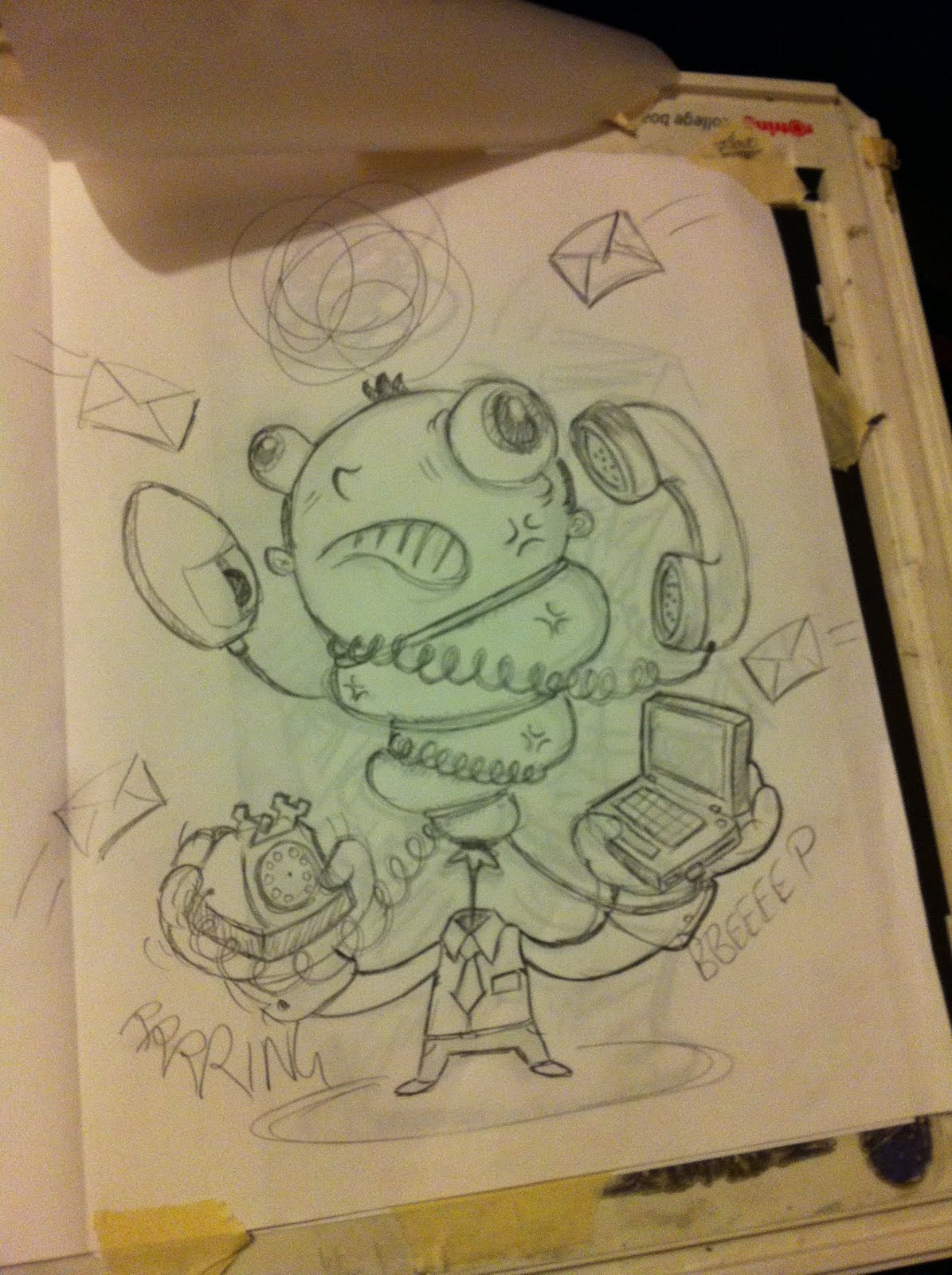
Stress: Strangely, this idea is what the tutors favourite and also the easiest to accomplish.. i sketched out about 4 sheets and then just started straight off by drawing the character... it couldnt have gone any smoother.. i literally only changed the head as I thought the expression wasnt clear enough.. or exaggerated enough.. the down side to this image came about when trying to colour it along with the other 5...


Chillwave: one of 2 last minute decisions to include this idea, it basically came about when I saw the existing article image was lacking in any real creativity.. almost like the artist didnt know what to put so just threw in a cd to represent music wiht a few other symbols about. My initial idea was to have a musician frozen in ice and playing on the word chill... but my comments on this were that it looked too much like a scooby doo cartooon... personally i saw that as a compliment.. i love cartoons.. however i then started to change the piece so it focused more on the idea of musicians forming their music in their bedrooms with no famous backing band or recording studio... this idea was given the go ahead but a different execution was needed.. there had to be more of a sense of scale... this big artist trapped inside a tiny box room.. i also started with this design when it came to deciding on colours.. whether to go a little more realistic and recognisable or by taking some of the skateboard inspired palettes.. in the end this one ended up more abstract when coloured and it defined how the others would be executed..


Sun: this was the very last idea i had.. i hated it. i came up with the idea very early on.. but i didnt like how it looked... i didnt feel i could capture it properly (no pun intended) yet.. looking at the finished piece now.. i actually enjoy it.. not for the drawing but for the background i created.. it ties the whole piece together well i think. There are so many options and so many variations i couldve done with this design but somehow i dont think any would work well enough...i also never realised how difficult it would be to draw the chassis of a truck..



I'm not sure if I like these final designs or not... i mean theyre still my own artwork.. but the colours just don't quite sit right with me... I know I wanted to create these pieces as editorials but I also wanted to then use the designs as stickers and possibly skateboard graphics... but now I dont feel like I can do that with them for some reason. I know this is stupid, as I can... but i can still make them as skateboard decks.. but the colour way is what puts me off them ever so slightly. If i'm to still add them to the bottom of skateboards then I feel I'd like to alter them and exaggerate them a little more.. in a spinal tap kind of way... from 10 to 11...

ah well.. it is too late for me to worry now.. all i can hope for is that i dont fail

24 hour monsters


Another project that came about via twitter... Jamie Roberts decided that for comic relief he would draw for 24 hours straight.. then all he needed was a theme.. and so came about the monsters... he was asking for others to donate their time in drawing and helping to raise money for comic relief... but also for people to donate artwork if they couldnt afford to spend time doing it live...

It took me a little while to settle on what monster to actually create but I'm happy with what I produced... it was separate from the course so I felt I had more freedom to produce what ever i wanted and it felt good. I'd actually spent a while drawing out my design and then using tracing paper to finalise the design.. (i've now realise i can skip the tracing paper and go straight to inking my work with my new trusty lightbox.. i just didnt have it at the time)...

anyway.. the completed works were auctioned on ebay and the money raised from the live drawing was all given to comic relief.. Jamie later admitted that he was happy with what was raised but felt liek he could've done more to promote the event and raise more money.. ah well.. next time maybe.. and there will be a next time.. with his plans to freelance more, he's also planning on turning the 24hour monsters thing into a regular sort of collective, but rather than monsters being the subject matter... he saw the artists as being the monsters... anyway... i cant wait for next time

I ended up screen printing my finished design and also with a few different colours.. the only downside was I printed a few too many prints. The idea of the auction was so that the winner would gain exclusivity.. but luckily for me.. the winner was actually a friend of Jamie's... so I sent him numerous copies of the prints I made and I will be passing one onto Jamie when i see him.. but the rest are just going to get dusty now..


my original screen kind of cocked up.. but as i keep saying.. its the little mistakes which kinda makes each one special..


Tuesday, 25 January 2011

Initial Ideas

I need to stop worrying about the wrong things :) and as I have done, I've immediately become more productive...

After taking the advice of my friend, Abby Ryder, (again)... I started breaking the brief down.. taking the main ideas of 'Heart' and 'Optimism' and trying to associate thoughts, feelings, experiences and situations with each, building a possible background story and/or personality to a character. Also taking the advice often found in Computer Arts Projects character issues, it helps if you inject a little bit of yourself into your characters, making them more believable.

The first of my ideas is an Alien character, one who dreams of exploring space, reaching for the stars, who always 'thinks BIG'. I love sci-fi and science, space, the stars and aliens so this is something I will enjoy creating... my initial idea was having the alien character crash land on Earth, I then had Anna Paldanius - the writer who I worked for in the 7x7 project for the Manchester Literature festival - come up a brief story to inspire me (sadly I havent yet given her full feedback on this nor informed her of my change in ideas)(Guess what Anna!?)... I feel this character could be developed further and grow with a narrative... so fingers crossed.

The next idea I came up with is inspired by Pixar's animated shorts and Michael Slack's 'Monkey Truck' (see previous entry here and here). Both Slack and Pixar invest a lot of time and personality into their characters, as I have said previously, a glossy visual style means nothing without there being a solid idea behind the work and time invested in making it come to life. With this in mind, I have the beginnings of what feels more like it will be an animated short rather than developing a character for a cartoon... but the premise is about a optimistic little light bulb who wants to fulfil his destiny and bring light to the world. It would be about using your potential, not being scared to shine, but also having the courage to go for it - in fact both ideas have this central theme - but I like the idea of a light bulb being determined to help us (humans) by giving us light.


these are all prelim sketches and do not represent how I will be executing the final thing, but for now my task is to develop both of these characters, seeing which one leaps of the page at me... (sketches of alien to follow)