I’ve always thought artwork needed to be digitally made in order for it to look finished/complete and professional… however the list of artists to follow smash that idea and prove to me that I can make a living off of my drawing.
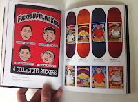
One day as I casually walked into Magma Books in Manchester – as I have done so many times before – I spotted a small book but thought nothing of it and carried on looking at the design magazine and illustration section… just before leaving I checked this book that caught my eye initially to find it was a collection of work by Marc McKee… on a whim I bought it… but it wasn’t until reviewing it later that I discovered McKee is one and has always been one of greatest influences when it came to drawing. I had only glanced the first few pages of the book in store but when I got deeper into it I found McKee had created some of my favourite skateboard deck designs for companies such as Blind and World Industries. It was during my teens that I took up skateboarding with friends and we’d spend half our time collecting stickers or checking what new board graphics where available… it was this which actually got me thinking about creating images to put onto objects such as skateboards and snowboards but there was never any mention of the artists who created these designs, so for years I haven’t known who created them... until now.
It turns out McKee had been designing these decks for years before I was first introduced to his work but his sense of humour hadn’t changed… The characters Wet Willy and Flameboy were just like Tom & Jerry, two characters with a hatred of each other and struggling to out do one another... only, the violence and situations are amped up a little more from the children’s cartoons and with more adult themes in some as in a few of the Blind ‘Reaper’ decks also… With my generation and the others after it being branded as numb/desensitized to things such as violence, sex and drugs as a result of music, television and computer games, the medium of a cartoon is another way in which I feel desensitizes the audience to the themes or situations drawn. It’s almost like the audience assumes that because it is an illustrated and exaggerated representation that it shouldn’t be taken as literal as the elements contained within it aren’t realistic. This actually gives the artist more freedom to create something that wouldn’t normally be seen in the real world, more possibilities are available as a result and allows for more even more exaggeration. We have all at some point seen a cartoon and I think it’s the association with them being for children that makes the work of Marc McKee so appealing, there’s a piece of us all that enjoyed the freedom cartoons gave/still give us and subverts the original meaning of cartoons and the adult situations depicted.
I forgot to add, that through buying this book i saw how McKee went about creating his work.. by drawing in pen if he made a mistake he had no other option but to use correction fluid... as seen above.. so.. I've started doing the same thing.. turns out it's pretty good!
Mckee's Skateboard designs : here


No comments:
Post a Comment