
Starting out as a wealthy, powerful and successful character, the michelin man has left behind the good old days of brandy, women and cigars in exchange for a cuter, more approachable and (yet again) a japanese influence in his recent design.


Early used advertisements featuring Bib....


There's so much memorabilia floating about for Bib and Michelin, but this goes to show that taking a successful character from 2D into 3D has been going on for years. I may think that vinyl/designer/art toys are a recent and current trend but I could even trace this act back to paleolithic era, where early humans carved idols out of stone.. in this case a fertility statue.


His more recent, leaner physique is attributed to trying to fit to a 21st century society and it's views on a healthy lifestyle... thus saying if the mascot is fat and bloated then their product must be...


"The Michelin Man's become a superhero of sorts--somewhat slimmer and more expressive than before--fighting against wear and tear while increasing fuel efficiency and safety"
Mark Figulio from the New York branch of TBWA creative agency says,


With McDonalds, it was easy to think of some stereotype or message to tag onto their company image/mascot.. but with Michelin it was a lot more difficult to think of something along these lines. The idea of having Bib deflated is just a funny image, somewhat rebellious as if some activist has come along and slashed his tyres but theres no deep and meaningful idea behind it... it's just a punk rebellion against what has become standard, subverting the original message or use of these mascots... (even though Im not rebellious at all!)

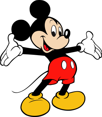
I then began digging up imagery for other characters that I could use, I started with American mascots, switching to ones from the UK, but then I thought about what characters I wanted to use and could come up with.. rather than traditional branding mascots, the idea changed to characters associated with brands and I landed on Mickey Mouse (Disney), Bugs Bunny (Warner Bros.), Cadbury's Bunny (Cadburys), Tony the Tiger (Kelloggs), Ariel, the little mermaid (Disney again but oh well), and of course the Michelin Man. Ronald McDonald, Homer Simpson and a couple others kind of fell by the way side as I either lost interest in the ideas or didnt feel they worked strong enough for what I had planned.
Visual reference:


there was even a small campaign, headed by artist Nate Pacheo, to bring back the old styling of Tony the Tiger..
Mark Figulio from the New York branch of TBWA creative agency says,
"There were rules, that challenged what could happen creatively." Indeed, the size of the tires, the shape of the face and other features had been standardized for so long...
The way forward then, involved a detour. The result: "The Michelin Man's world changed more than he did. He's still a very friendly, joyful character," and by placing him in animated scenes rather than the real world, they were able to deal with fuel efficiency and safety in a much more engaging way.
Taken from link
which sounds very similar to this.. (listen to the music, narrative and voice over)
http://www.youtube.com/watch?v=4nxMrRXHqpo
and also... Get to know the Michelin Man.. at his very own page on the Michelin Tyres site.
More reference for the character himself from the 80's upwards to present day.. the general shape hasn't changed but I started thinking about what could have happened to him from the late 1890's when he first started work up to present day... would the condition of our roads finally gotten to him? would he no longer be able to imbibe road obstacles and debris? or could he have just let himself go and be over inflated?
More reference for the character himself from the 80's upwards to present day.. the general shape hasn't changed but I started thinking about what could have happened to him from the late 1890's when he first started work up to present day... would the condition of our roads finally gotten to him? would he no longer be able to imbibe road obstacles and debris? or could he have just let himself go and be over inflated?


With McDonalds, it was easy to think of some stereotype or message to tag onto their company image/mascot.. but with Michelin it was a lot more difficult to think of something along these lines. The idea of having Bib deflated is just a funny image, somewhat rebellious as if some activist has come along and slashed his tyres but theres no deep and meaningful idea behind it... it's just a punk rebellion against what has become standard, subverting the original message or use of these mascots... (even though Im not rebellious at all!)

I then began digging up imagery for other characters that I could use, I started with American mascots, switching to ones from the UK, but then I thought about what characters I wanted to use and could come up with.. rather than traditional branding mascots, the idea changed to characters associated with brands and I landed on Mickey Mouse (Disney), Bugs Bunny (Warner Bros.), Cadbury's Bunny (Cadburys), Tony the Tiger (Kelloggs), Ariel, the little mermaid (Disney again but oh well), and of course the Michelin Man. Ronald McDonald, Homer Simpson and a couple others kind of fell by the way side as I either lost interest in the ideas or didnt feel they worked strong enough for what I had planned.
Visual reference:


there was even a small campaign, headed by artist Nate Pacheo, to bring back the old styling of Tony the Tiger..

No comments:
Post a Comment