----
The brief asked for us to show our 'brave new vision for illustration' and 'new ways that illustration can be integrated into the music experience'.... I immediately thought I'd enjoy this purely as it would allow me create something new rather than just a basic illustration and I got to work with music of my choice... It was also a possibility to have a break from character design, although I did still end up wanting to change to the Disney animation brief half way through..
Anyway, I decided on using these 2 tracks from the artist Four Tet (aka. Keiran Hebden)
Circling:
A smile around the face:
Although due to the time spent on the project, I decided that if i could successfully come up with a format in which to show off my illustration then I could easily adapt the imagery to the 2nd piece of music but still within the format.
with that in mind, I based all of the following work and research on the track 'Circling'...
I immediately had the idea that I wanted to create a large scale image... similar to that of the cross pathway doorway project... but at a different size. Rather than a standard square shape, I wanted to create a piece that you could immerse yourself in and experience as opposed to just 'looking' at it...
it actually reminded me of an old photography brief I wrote back on my first degree in which, I wanted to take the process of turning a photograph - back into a three dimensional experience as opposed to just printing an image and it remaining a 2D representation of a 3D object/place. I started creating panoramic photomontages in hopes that I could eventually print them large enough so that the audience could actually stand in the middle of the image and have to spin a full 360degrees in order to view the work...


I then got even more carried away with the idea and decided that I wanted to enhance the 3D experience and involve the use of anaglyph (or the Red and Blue glasses in layman's terms). I wanted to take the process of making the two dimensional into three dimensional further... by adding the illusion of depth I felt it would again enhance the audiences experience but mainly it would make them smile... its easy for me to say now as I have realised that I create a lot of work out of nostalgia for my own childhood and to make people smile or laugh... but at the time I didnt know why I wanted to bring back the red and blue glasses... it just seemed the right (fun) thing to do.
Finally, 5 or 6 years later I get the chance to realise the idea I had back then... this, combined with the recent Carnovsky installation I saw in Berlin, sparked hundreds of ideas in which I wanted to create an interactive play ground for my illustrations to sit within.


I started at a fairly small scale, thinking the illustration I create could be a long panoramic poster, but this quickly progressed into the large 360 structure idea.. and further.. I was imagining what it would be like to have a room dedicated to a single piece of work.. you would be walking into the the work and becoming part of it.. bringing in the idea of interactivity.. but for this to work I couldnt just draw over the walls and be done with it.. the audience would need to feel some sort of reward for entering the room or curiosity to do so in the first place. I even played with scaling the 360 idea down to a single person apparatus that could be worn around the head or that would need to be pulled down over the head in order to view it.
Anyway, I decided on using these 2 tracks from the artist Four Tet (aka. Keiran Hebden)
Circling:
A smile around the face:
Although due to the time spent on the project, I decided that if i could successfully come up with a format in which to show off my illustration then I could easily adapt the imagery to the 2nd piece of music but still within the format.
with that in mind, I based all of the following work and research on the track 'Circling'...
I immediately had the idea that I wanted to create a large scale image... similar to that of the cross pathway doorway project... but at a different size. Rather than a standard square shape, I wanted to create a piece that you could immerse yourself in and experience as opposed to just 'looking' at it...
it actually reminded me of an old photography brief I wrote back on my first degree in which, I wanted to take the process of turning a photograph - back into a three dimensional experience as opposed to just printing an image and it remaining a 2D representation of a 3D object/place. I started creating panoramic photomontages in hopes that I could eventually print them large enough so that the audience could actually stand in the middle of the image and have to spin a full 360degrees in order to view the work...


I then got even more carried away with the idea and decided that I wanted to enhance the 3D experience and involve the use of anaglyph (or the Red and Blue glasses in layman's terms). I wanted to take the process of making the two dimensional into three dimensional further... by adding the illusion of depth I felt it would again enhance the audiences experience but mainly it would make them smile... its easy for me to say now as I have realised that I create a lot of work out of nostalgia for my own childhood and to make people smile or laugh... but at the time I didnt know why I wanted to bring back the red and blue glasses... it just seemed the right (fun) thing to do.
Finally, 5 or 6 years later I get the chance to realise the idea I had back then... this, combined with the recent Carnovsky installation I saw in Berlin, sparked hundreds of ideas in which I wanted to create an interactive play ground for my illustrations to sit within.


I started at a fairly small scale, thinking the illustration I create could be a long panoramic poster, but this quickly progressed into the large 360 structure idea.. and further.. I was imagining what it would be like to have a room dedicated to a single piece of work.. you would be walking into the the work and becoming part of it.. bringing in the idea of interactivity.. but for this to work I couldnt just draw over the walls and be done with it.. the audience would need to feel some sort of reward for entering the room or curiosity to do so in the first place. I even played with scaling the 360 idea down to a single person apparatus that could be worn around the head or that would need to be pulled down over the head in order to view it.
As I mentioned, I wasnt satisfied with just having a straight forward illustration drawn/printed/painted at a large scale.. so I began imagining what else I could include to make the piece come alive and be more interactive. I've already mentioned the 3D glasses idea.. but what about if I made actual 3D elements? combined with anaglyphs within a 360 structure?.. its at this point I got carried away and began researching...
My initial ideas came from little objects, cards, artwork and previous work I had seen where I began experimenting on how they work...


I jotted down all the main ideas I had so I could make a list and figure out what I was going to make and also how I could cram them into 360 structure...


What actually stumped me more was wondering what to actually illustrate... never mind the format or the added visual experiences... if I could think of something to actually draw then I could get started on creating it.. However.. i had no idea what to do. I went back to listening to the track and thats when I started thinking about a narrative and imagery that I associated with music...
I personally interpreted the music as if I was underwater or floating in space... theres a gentle rhythm and repetition that relaxes me as if I was drifting along but also exploring and experiencing new sites as I went further into space or the underwater environment I was imagining myself in... I felt like I needed a background/scene in order to place this new imagery but it turned out somewhat static and almost too plain..


If I wanted to create the feeling of being submerged in an underwater alien world... then I had failed as it looked too familiar... there was nothing new or alien about it.. so... because the music contains no lyrics.. I could happily invent and interpret whatever I liked.. shame I didnt get more abstract. Instead I wanted to focus on what aspects of being in an underwater environment made it feel alien... the plant life.. Coral.


I even took some photos of my own at a local aquarium..


I just love this image because of how the light is reflecting off of the surface of the water and the bubbles just breaching the surface...

I then started trying to add this imagery to some of the 'vessels' I had started to imagine for my work... combining underwater plant life with 3d moving bits, anaglyphs and QR codes... but i still wasnt happy.. i didnt feel like I had researched enough.. I might want show that its underwater but what do I depict to show achieve this?


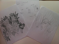
Although the deadline for the competition isnt until March next year, we had an earlier deadline to meet to check our progress... sadly I think I spent too much time on the rest of my research (to follow) and thus didnt get started on the practical side until late again (as I did with my negotiated project)... Instead I feel like I have come up with some interesting ideas, but failed to execute them and show them off to their fullest potential.. much like how I feel about myself and my work most days!


Although the deadline for the competition isnt until March next year, we had an earlier deadline to meet to check our progress... sadly I think I spent too much time on the rest of my research (to follow) and thus didnt get started on the practical side until late again (as I did with my negotiated project)... Instead I feel like I have come up with some interesting ideas, but failed to execute them and show them off to their fullest potential.. much like how I feel about myself and my work most days!


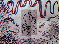
I like the 3D part that I created, as its the first time Ive actually made an illustration using this technique.. but it isnt 100% successful.. certain aspects work where as others dont... e.g there is clearly a divide between the foreground and the rest of the image.. but any other levels of depth feel a little flat.. now I know experimenting with the distance of the offset between each layer can control this.. but I;ve recently discovered the direction the layers are offset also plays a part in the image... (whether the red layer is shifted to the left or right)... I love the idea of including an area where people can draw their own little section.. but the reason for doing this isnt clear yet.. do they do it to add to the piece? or out of boredom?

I only have myself to blame for putting off a lot of the research, but its only because I get excited looking for inspiration.. I enjoy seeing exciting new uses of technology or materials.. people playing with scale and illustration.. as well as fun bits... I personally feel the work I "submitted" so far is just a basic start.. it still needs a LOT of development... but I think it shows in the amount that I handed in and the quality of the work... I received some positive comments about what I exhibited but its not as exciting as all the ideas I originally started with... I can either choose to push it forward further for submitted in March.. or I am seriously considering entering into the Disney animation brief and using it as an excuse to learn AfterEffects ( as suggested by my friend Tom Rainford, who I met last year at the D&AD awards, and who is a master at AE.. in my opinion, even if he doesnt think so!)
speaking of which..
when i started frantically to produce some work at the end, I felt more comfortable trying to imagine characters that would inhabit this space.. sticking with the 'Floating' theme I started trying to imagine some creatures who would live and move in this environment... I felt more at home and excited doing this rather than the rest of the whole project in all honest.. why? because I like the idea of bringing these things to life.. hence why Im imagining that animation is the next natural step for some of my work....


No comments:
Post a Comment