Some visual reference for my bulbs... all of the images below have in some way informed my final outcomes whether that is my mocked advert, my initial animation ideas or my bulb boxer (see Bulbio part 4)
Firstly, seeing as I was creating a 40's and 50's inspired advert, what better reference than the adverts themselves...
In most cases, the product is made the centre of attention - often held/demonstrated by a hand - with the text, slogan, name placed around it. What I tried to do was keep a similar feel for this in my own image as well as limiting the colours used so it would keep production costs down.. I may have had the elements needed to produce an image like these, but I dont think I actually achieved this... yet..

I love these business cards for
Shyama Golden, as the white space around the image and text is well balanced.. (its easier criticising my work now as I look back on it)... but the effectiveness is not having too much going on... theres text, and a single image.. no background, its not in full colour but the printing method adds to the cards charm.
another mock 40's/50's advert using silhouettes rather than over complicating the design with details but its the angle of and the type used that sets the age of this piece.. then you just need to distress the piece.. and hey presto.. (or so i thought)
an example of how I could create the outline and highlights of my bulb...
I've beaten myself up numerous times over whether to hand draw everything or use digital techniques.. this piece looks completely hand drawn and digitally added to a paper background later. anyway, it shows a lightbulb character with a set of legs which I originally thought looked odd on my designs, but either way it is a character made out of a lightbulb.. with a face added to the glass.. without over thinking how the glass would react etc.
I dont think the legs look wrong on these characters, but I do think that by removing the legs it gives my bulb something a little different. Ive had to come up with a different way of him moving, plus my characters arms come out of the glass and not the metal fitting. Another happy go lucky bulb character.. found via DeviantArt.
Another DeviantArt find, i chose this piece due to the cute and innocent appearance of the face... Bulbs are quite fragile, and this face adds to that fragility.
A stumbled upon art show over in america, but what caught my attention was the mocked up cereal boxes.. I could mock up an oversized package for the bulb character... but also the quirky/sarcastic comments featured as slogans on the boxes design...
Similarly, I like the packaging on these cigarettes.. the cat mascot and the name 'Lucky' works well since we all now know the dangers of smoking and the whole 'cats have 9 lives' thing... but in terms of an advert.. the one single colour used to draw attention to packaging and name, works even better than the gag...
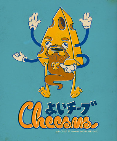
This series of fake japanese vintage adverts was created by
Juan Molinet. Each mocked up brand has their own mascot made from the products the companies produce. The ageing of the pieces is a lot more subtle in some of these pieces than in others ive seen... the backgrounds have a slight amount of distressing, the prints have been offset a little but its not in your face.. it all adds to the piece.. where as some of the techniques i have used have distracted away from the idea and character...
I have since then found various characters either adding life to an inanimate object etc or that incorporate design aspects I want to mimic... (these range from contemporary pieces to older adverts and paraphernalia)
i particularly love the Esso Oil Drop.. it really makes me wonder what artists/illustrators/designers did before the invention of photoshop etc.. but also.. why do we depend so much on it now? the little pin badge version of the oil drop looks as if his lines were hand painted ... where as nowadays the closest we get is vectored lines.
Because i was also searching for reference for my bulb boxer.. i came across this Star Wars themed fight poster.. the distressing to the design adds to its believability...and the fold in the centre takes it from being a flat digital piece into a mocked up real poster... showing the design in context.
I managed to find a few lightbulb characters via google.. but most of them are the same clipart looking set of eyes and mouth added to ANY shape... here are some of my favourites that add character to the bulbs and also a few bulbs used for reference to shape etc.
i found this image a while back and always liked it for the use of the hand drawn line...ive always had it in my head that a finished piece shouldnt look sketchy or hand drawn but crisp and smooth.. (hence why i thought vectors were the be all and end all of design).. but showing the texture and inaccuracies of the pencil line gives the work character and something unique, something that you know no one can steal when you have drawn a character or piece yourself... i later found the artists website...
MIKE LOWERYI've also looked at
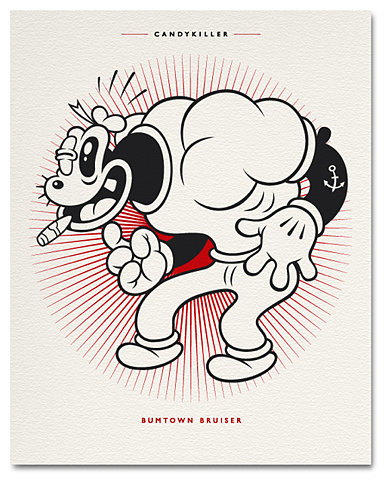
CandyKiller (aka Brian Taylor) before but I keep coming back to his classically styled characters and how they are often isolated on a background in a similar way to how I like to produce my own.. this particular reference may not seem apparent when looking at my mocked up advert.. but when you see my Boxer (part 4) then hopefully it will be more apparent.
a few still images of the milk carton from Blur's 'Coffee and TV' music video...as well as a papercraft model showing the character and his girlfriend... you can literally add a face and limbs to anything and it becomes alive.. or we project "life" onto it by seeing these signs and then imagining how it could move when it comes alive.