Showing posts with label 7x7. Show all posts

Sunday, 19 December 2010

Poster Inspiration


A collection of posters taken from GigPosters.com

I'm not sure if I already explained my actions during the 7x7 brief, but I often find that I get too bogged down in trying to find a style. My visual language is all over the place, I was trying to draw a character and then suggest character through drawing other objects but instead I thought that using actual photographic images in my work would negate the need to find a style. It also drew on my experiences with screen printing and photography... slowly combining aspects and skills I had learnt and forgotten within photoshop.

Each of the posters above shows one way or another, the techniques that I employed in my 7x7 designs. Screentones create a fantastic effect of tone without using solid blocks of colour - perfect for early printing methods - and as such also add a feeling of nostalgia, harking back to the comics i read as a kid. The silhouetted shape of a man falling - used in the 'Trail of the Dead' poster - doesn't show us any specific details about the unfortunate man, but we read information such as he is wearing a suit by how his clothes act on his frame, he is a male shown by his short hair and we assume he was pushed as he is falling with his back to the floor... semiotics is fun ;)

And finally, the 'Motion City Soundtrack' poster showing the gentleman with a broken heart inspired the using of objects and personal belongings to represent their owners/characters. In creating a character, there are simple techniques you can use to make anything appear human-like.... adding arms, legs, eyes and a mouth are the easiest and in doing so they often become new characters on their own. Then adding a personality and creating a posture for them bring them to life and allows you to imagine what they would be like if alive...

Playing catch up...

I'm going to be doing a little bit of catch up now, as I've been putting it off over the last few weeks and eventually EVERYTHING fell on top of me like when you stack up a huge pile of books and then realise you need the one from the very bottom! This first term of 3rd year has scared the crap out of me... I don't feel I have produced as much work as I was doing in 2nd year nor have I produced something that I am truly happy with... everything feels like its still a rough piece of work...

My time management skills have been none existent so far, which scares me for the future, and I thought I had learnt all my lessons I needed to in 2nd Year... turns out I hadn't. The last 2 projects have opened my eyes to the importance of prioritising and knowing when to stop/start.

But, more on this later.. as I said.. I need to catch up.. so...

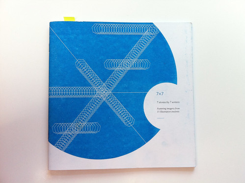
Jumping back to the start of the year saw the 7x7 collaboration project, between ourselves at Stockport and the creative writers from MMU, come to a close with all of our finished illustrations being compiled into a book which was sold on the night of the event. We'd all pretty much finished this work before the start of 3rd year, but when it came time to printing, a lot of editing/tweaking was needed. It was agreed that we should try something different this year and make the book a little more appealing - design wise - and enlisted the help of Olivia and Mike from the 3rd year Graphics course. Through a mix of their ideas and our own, we came up with having a square format to the book and limiting the colours due to printing cost... none of us knew just how awkward this was going to be when we settled on it.

IMG_1929

Long story short... I'm not bragging that I am amazing at using photoshop, but basically... no one else understood how to firstly convert their artwork into only 2 colours, or how to set it up ready for printing (after Rick kindly explained the process). It ended up with the majority of people editing their artwork to so that it appeared to be in 2 colours (blue and black with the white being the colour of the paper beneath) and some managed to crop their work to the new format sizes given. But in the end I was having to remake everybody's artwork... colouring photos to 2 colours, eliminating white from the images, separating blue and black onto different layers, cropping to size, making the spot illustrations into circles and then passing this on to Olivia and Mike, as well as editing a few other images used in the book in the same manner. Now, I'm not having a go at anybody here, as I understand some people just don't know how to use photoshop, but I pretty much did the entire job for at least 3 peoples artwork, who otherwise would've missed the deadline and not gotten printed.

I'm actually happy with the outcome of the book on the most part...


I am one of these people (like the character, Dr.Cox, from Scrubs) who likes to complain about having to do peoples work for them, that they can't do it for themselves.. but secretly I enjoy feeling like I am useful for something and that people come to me because they trust me.. but NOT because they are lazy and just dont care!

Anyway, things got sorted... Olivia and Mike did an outstanding job on the book design and everything went to plan.. except when the printers got a hold of it... We had done everything we possibly could to set it up so there was no mishaps when it came to printing.. yet somehow... out of the 125 books we ordered.. we firstly only received 115-120 of them, approximately 70 of them were legible/sellable but the rest had missing pages or illustrations. Some pages were duplicated, others were printed correctly and about 20 books were a complete right-off.... so... all in all this was a successful real life learning curve. We understand that problems can happen during the process and we did everything we could to make sure that it didnt go wrong on our part... but it just felt like a bit of a kick in the teeth, right at the last hurdle...

(and then the event night happened.. which is another story for another time!)

(evidence of poor print quality)


Wednesday, 6 October 2010

7x7xdeath

Hopefully I have seen the back of this project now! Don't get me wrong, it's been great to have real world experience of creating a piece of art, passing it on to a design team who then come back with alterations and then chatting with the printers who need to receive the artwork in a specific format but thank **** it's done!

Starting with my own work, I was already happy with my main image but it was the spot illustration that didnt quite sit right on a page or look like part of a set. I think having the summer away from the piece of work definitely helped, as sometimes you can be sat so close to an image that you cant see whats wrong until you step back. Luckily, I feel I have made the spot image more dynamic and I'm actually prefer it when compared to the main one as it holds more character in my opinion. Originally I was using the halftone screen printing technique as a way of holding the two images together and using the same colours in hopes that people would just assume they belong together but now I hope the audience will see a relationship not only between the characters in the story but also between my images.

Main Image:


Spot Illustration:


Because I am looking at character as a theme within my work, I'm happy (for the time being) with how the images work. The story I was given to illustrate didn't focus on character descriptions too much - we are told certain aspects such as the female character has red hair and the male is wearing a shirt, shoes etc - and so I had to make sure I wasn't trying to create specific or generic characters. I have suggested the female character by using elements such as her hair, hand and lips to form a seductive womanly image. Similarly I have used the shoes, a shirt and tie, the chesterfield chair, and the large eye to form the male character who is sat watching her perform. There are then other little details which I feel add to each character, such as the tears showing the womans emotions with the situation, the frilly cuff/clevage to again emphasize a seductive and sexual side to the her and the shape of the hand/glove not only forms her face but I altered the length of it for a curvier shape to hint at the natural shape of a womans bosom and hips as well as using it for a long slender neck.

I think I was actually quite lucky with my choice of colours... We had initially planned for the whole book to be printed in colour, meaning everyones images would've looked exactly how they created them but disjointed. Now I know the stories featuring in the 7x7 book arent linked, nor continuations, but due to the limited budget the choice to print in Black with a single spot colour was made. As I said, I was lucky in that I had already limited my colour range and so it wasnt as big a problem altering my images to using black and blue (the colour we decided on) and I had already been looking at screenprinting my work just for my own benefit... but I now actually prefer the spot colour versions more than the coloured ones I created earlier.

7x7 cover teaser


7x7 teaser


Another part of the 7x7 project involves working with a 2nd year Moving Image student to create a short 10-15 second animation. I often admit that I like things done my own way, and I often do them myself so that I know they are done properly but i also like relinquishing control as i usually prefer what someone else makes with an idea than my own interpretation. (i sometimes try too hard to make things look 'Cool' and appealing to everyone). but basically... my initial ideas of a Mad Men/Catch me if you can or animated comic styled piece of work went out the window when I was introduced to Kirsty Newman (i'd add her blog or site.. if i knew it). She really liked the halftone pattern work in my images so I was tasked to create some images for her to use and animate with... Now I must stress... I have been rubbish. It took me ages to actually get the image to her, I was busy editing other peoples artworks ready for printing and separating the layers, but she's been an absolute star with delay after delay as well as putting up with me in general. Anyway, providing this one image was actually harder than i thought purely because of the sheer size it needed to be in order for her to zoom into it!


but as I said, she's a star and has sorted it along with compositing some live action dancing to represent the female character. I know very little of After Effects and Premiere so I have given her free reign over it, but through not giving her the image she needed early enough, Ive put her under a bit of stress to meet her deadline for this friday :( sorry Kirsty. I already told her that I wasn't exactly impressed with my own efforts, nor happy with the image I supplied to her but she actually has it on camera where I say that it's all my fault, I've been useless and that I hate babies... but theres a possibility of us working together again in the future on a couple of side projects... (one being liked to my old figure animation I had planned... Characters and Backgrounds)

Sunday, 12 September 2010

7x7 animation

I only have rough ideas in my head for the animation to date... but starting Tuesday afternoon this will again be given a push forward. In terms of how i'd like it to look.. I want it to look great! I'm not a full blown animator but I love the way in which something which was once still/flat/2d can be brought to life.. as shown in the many abundant animated comics out there now.. one of my favourites in particular is the working of Image's Dead Space comic, based on the events before the popular computer and featuring the artwork of Ben Templesmith.


Thinking back to the theme of the story and it's character.. something a little more abstract AND classy springs to mind... Considering the animation will only be 15 seconds long (approx) then I won't have time for a narrative, only hints to the charcters and their relationship etc. For example.. one of my ideas works on the image of smoke rising from a cigarette resting in an ashtray... as the camera pans upwards following the rising trail... the hourglass shape of a woman can now be seen dancing in the silhouette of the smoke... she is dancing and removing her silk opera gloves and the camera can zoom in to the space inbetween her arms.. as it does the male character can be seen... etc..

Sketches to follow...


and I have mentioned it way back when we first touched on the project.. but the intro to the show 'Mad Men' is pretty damn close to what I'm imagining... HERE

Friday, 7 May 2010

eye eye


absolutely loving the style and humour behind some of the work by Zombie Corps.

and some other bits...

Monday, 3 May 2010

last minute rush...

this week is gonna be a mad week...

got a few things to sort out:

print my final 7x7 images,
organise, reprint and finish off previous projects,
sort out my presentation for wednesday,
clean up my website portfolio, and finally....

throw some stuff at this blog to show "research" hahaahha

so.. let the throwing begin

After taking the initial plan of silhouetting my design whatever it may be, I started looking at Noma Bar (and this interview with the artist himself). It was a mix of the simplicity of his work combined with the character shown in each piece that first attracted my attention, as he sums up the personality of a well known figure through objects/shapes linked to their life. I thought of trying to do something similar with this project but I was falling into the trap of just copying Barr's work rather than creating something that was my own, or something that was fitting to the story...


As I have mentioned, about a million times, I've also been looking at Abram Games' work... and no, i STILL havent scanned in any pages from this magical book of his I own. However, rather than looking just at the finished product of his posters or possibly using an airbrush, I've been mesmerized by his sketches and thumbnails... seeing how an initial idea has progressed and developed. In the past I have usually drawn out a few thumbnails and then turned straight to the computer, not referring back to the drawings and often feeling as if my sketches are more successful than a finished piece...

through looking at Games, I started to draw out and develop one single idea more... trying to rearrange little bits and reposition things.. but again I found through doing this, I was now getting too caught up in trying to perfect a sketch... but it will always be a sketch and I wasnt actually creating anything for a final piece.

I feel like I'm progressing a little too slowly, I'm stuck in some of my ways and I get caught up in the newest and most exciting process/method ... but it isnt until I finish the project that I realise what I've been doing wrong. I enjoy playing with ideas and designs, testing out new compositions and affects (hence the screentone look to my recent stuff) and this is one of the reasons why I'm really considering working as part of a collective/anonymous artist. I feel like I'm worrying too much about what the artwork is saying about me rather than it fulfilling the brief, yet by "hiding" behind a name which isnt my own (e.g. Pieface, an old nickname) i dont seem to worry about not having one particular style... now i know im worrying too much but I cant help thinking about the future...

----

I cant remember exactly how I came across this, but there truly is no more original work anymore... :(


----

Also whilst researching bits and bobs for my presentation this wednesday, I've been trying to think of other places I seek out inspiration... and most of the time I end up looking at posters/screenprints... so much so I have widget on my iGoogle page from GigPosters.com that randomly shows a different poster every time its loaded.

The site (and book) contains posters both digitally and traditionally printed from a variety of artists/collectives for a variety of bands/artists. Now I cant seem to put my finger on what it is exactly that I like about these posters... whether its jsut the aesthetics of each or the technique but whatever the reason... i feel immediately inspired and jealous when I see these...

(a selection of my favourites...)


Ended up returning to Modern Dog for a bit of inspiration too... but again, rather than looking at their finished products... I was more inspired by their work environment... I cant remember if its in the Steven Heller interview in their book or not, but I recall how Robynne Raye and Michael Strassburger describe the production of one of their posters... whilst each partner of Modern dog works individually, being in a studio environment leads to giving each other crit on their designs (such as adjusting the composition or moving a specific element) but it still has the original artists "stamp" on it. I'm one of these people who likes to do things themselves - to make sure it is done right - but I love being in the studio at university for the very same reason...

----

in terms of what I'm doing now... i figure I'll show what ive finished on, and some of the progression of how i got there...


There are still a few things that I'm not 100% set on (such as the tears on the hand, the ornate backgrounds and the eye being red) but I have a little bit of time to tweak them before they go to print...

its strange thinking of the initial sketches I had when compared to these but also the original mock ups I made of the hand/face design...


I started looking at "real"/photos of hands for reference (hence the mock up above) which progressed onto the silhouetted shape in my final images... but I was originally going to simplfy them in a Noma Barr style using illustrator... but they didnt appeal to me as much as the screentone effect of my mock screen print :)


In order to reach my final images... i played with different elements and tweaked little bits here and there...


I think that about sums everything up that I've missed in the last couple of weeks... unfortunately, I didnt manage to meet up with the writer of the story Im illustrating for (due to volcano flight delays).. however.. its kinda too late now for her to make many decisions.. i can only hope the crit session goes well... if not... i'll cry