Showing posts with label research. Show all posts

Sunday, 15 May 2011

Front magazine


Bill Presing

Shane Glines

Ashley Wood


Chris Sanders


Ok, this next piece will feel almost like a confession.. I like women.. I also really like artwork focused on women.. usually the curves or their body or the just the sex appeal that they show…. This is why I enjoy the work of Bill Pressing, Shane Glines, Chris Sanders, Ashley Wood and many more.. but I’ve always thought people would see me as a pervert if I created any artwork like this.. like it was a prepubescent urge to draw dicks and tits on everything…

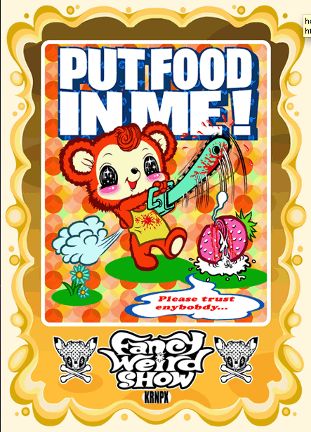
but my point is.. I occasionally buy magazines like FRONT… originally this was just like any other lads mag.. reviews on products like a boots catalogue, film and gadget reviews and the usually splashing of boob in between.. then one day they did an issue that saw 2 models face off against each other in the Chav vs. Emo issue.. it was their largest selling copy apparently and ever since then, they have been a more altrnative lads mag.. stil covering the same sort of thing but catered to a different audience.. my sort of audience.. the point im trying to get to is… within this magazine they feature illustrations by Mr.Gauky and Matt Skiff… both who have an alternative appeal in their work.. so maybe if I set myself up as a freelance illustrator I could approach them and be involved in the magazine somehow.. but more recently has seen the addition of Albino Raven aka Glen Brogan who has a very comic book cartoon inspired style.


He again creates characters to act and pose in his editorial pieces for the magazine but this time with a slight hint of realism as the characters aren’t distorted/deformed too much compared to some of my previous references... but following his blog I have also found a tutorial showing how he goes about creating his work from concept to finished piece. I love seeing artists original sketches... this is a stage in which I need to filter out the crap faster than I have been doing… but I also love seeing how Brogan adds colour to his work… This is something I’ve recently been discussing with a friend and my tutor… they both believe I should look at colouring my black outlines so that the black isn’t too heavy in the piece... but for 2 different reasons... Abby first thinks that it gives a more cartoon like appeal and also softens the image and colours… where as Ian thinks that it wont look cartoony but instead will make certain elements stand out more by balancing the colours around the image. Anyway, back to Brogan… despite my recent work taking on a more extreme colour palette as I was told my originals were too realistic, I feel I could’ve developed the realistic colours to more muted tones, possibly of a similar shade like Brogans and still completed a successful piece of work.


Mike Budai


After buying my first poster print from the Richard Goodall Gallery, I went back looking for more.. and again I spotted a series of posters by an artist whose work I had seen before but never made an y conscious effort to find out his name… the work of Mike Budai is similar to that of Jay Ryan as in they both use cutesy animal characters in some of their work but mainly as they both had draw their pieces and create more dynamic action packed scenes where something is happening rather than just a bog standard isolated character stood like a statue. At the risk of sounding like a broken record, I never thought hand drawn work would be so popular… I didn’t think that people appreciated it and always wanted the clean crisp polished look. The reason I picked up these prints by Budai is purely because of the characters within them… they have a huge appeal to my cartoon loving inner child because of their cutesiness but also the over the top and imaginative idea behind them such as the cute devil and his sacrifice, the bunny pilots, the moustached flying robot thing and finally the nightmare creatures.

the prints i own:


I’ve never had the confidence to draw out type either.. being so close to the work I often spot mistakes more and more.. often too easily and then I point them out which makes it worse.. but by doing as Ryan and Budai do.. the type then becomes part of the design and not just information that is a formality. The final thing that I love about these prints is that they are again screen printed... often meaning limited colours but also you have to consider the order in which you print too.. Normally the black line is the last thing to be added to design as it covers and misaligned sections etc but in particular.. the bunny pilots has a lighter yellow opaque ink added so that you can still see through to the detail underneath… thinking of this and even allowing/knowing that you can do this just makes the design stand out that little bit more in my opinion.. it shows a more careful consideration and understanding of the medium used. Also, I keep forgetting to add but the reason I enjoyed screen printing so much and why I enjoy using my hand drawn lines now (or seeing these techniques used by others) is because it allows for accidents to happen and sometimes these things help improve or give texture to the work so each one becomes a one off never to be recreated.

In the bunny pilots piece I actually love the use of a silver ink.. as it contains a silver fleck in it that actually reflects light when you catch it right… It just shows that I can use inks like this to achieve a different look with my work… in fact this is something I may try recreating for a limited run print which will be auctioned off later in a month or two.. I just need a solid idea first before I start this.


Derek Yaniger

Bear with me on this, although Derek Yaniger’s work can appear much like many other 40/50’s inspired artists, adopting many of the characteristics associated with it... side profile views of the head and body, large noses making up the majority of the face, simplified facial features and a Jim Flora-esque distortion and exaggeration to aspects of the characters but the main thing is that he draws and creates these characters himself and I love his Hawaii/tiki themes in his work (and dress sense). My recent way of working involves a lot of detail where as I admire Yaniger’s simplification, where any unnecessary detail is rejected... leaving only the elements you need to define the characters or scenes they are depicted in. There is also a strong sense of cartoons mixed with an adult view point in his work - in this particular image of the peeping tom with an elaborate device for spying on the changing woman, the humour of the event is emphasized by the excited jumping of the character… the steam blowing out of his ears and large grin on his face. Another aspect of his work I admire is the limited colour palette… some times a mix of shades of the same colour or complimentary ones but more often that not they are muted tones reminiscent of the printed colours from the era in which he draws much influence.


As I mentioned, his work is predominantly viewed from a side on profile and this often affects the angle in which he draws the rest of his scene to the image.. sometimes ignoring a realistic perspective in order for maintaining a clearer view of all the elements. But the main thing is he adopts a very cartoon like approach in exaggerating details in both the characters and their scenes they’ve been placed… I think I need to remember this in my own work rather than going for a realistic or understandable idea.. I can distort what I am drawing.. after all.. it isn’t real and as Ian said to me… this is why they commission illustrations as they can illustrate things that can’t be recreated in real life. Shape actually plays a strong role in his work also, I can see he has fun playing with the shapes of objects, the position of characters limbs and the overall composition, very much like Jim Flora, but I like his consideration of which shapes best suit each character… e.g. a short character is often more rounded, characters of children have oversized heads in comparison to their bodies and most of his female characters have long legs leading to larger hips with an hour glass shape and slim arms.

Jonathan Edwards

After working in the LOVE creative studio and meeting Alan Wardle, I started to look back through my old issues of Computer Arts Projects for some of the names of artists he spoke about. One in particular cropped up in the ‘Editorial’ issue… I had already followed the blog of Jonathan Edwards and even found him on twitter, but I didn’t realise he had a tutorial in this specific edition. He has become another great inspiration to me in that he too uses hand drawn imagery, he inks each piece by hand and then adds colour digitally afterwards… this has now become my preferred way of working rather than vectoring my work as it is a way for me to maintain that hand drawn aspect in my work. His guide shows that he begins by sketching out any and all his ideas… developing them until he gets approval for one and then he inks the final thing.. very much like how comic artists work… thumbnailing their ideas, adding detail to the approved image and then inking the final lines before adding colour and going to print. I had never picked up on the fact that his work was hand inked… by scanning it in and adding colour digitally it gives the impression that he could’ve used hand drawn effect brushes in Illustrator, but this is why I enjoy pickin up these magazine as they offer an insight into how these artists work. I have asked Edwards how he chooses the colours he uses in this work but either he isn’t giving away any more secrets or it really is by luck that he picks the right one for the job. Judging by some of the images in this tutorial, it also appears that he works on a very large scale allowing finer detail to become easier to work on rather than struggling at a small scale.


This little snippet is what made me change my mind about doing editorials... I like the idea that I will receive varying articles and thus be able to work on a variety of different projects but I won't know until I give it a go ;)

Kustom Graphics


Recently I also picked up kustom graphics 1 and 2 and I have realised that there are a lot more artists out there doing the sort of stuff I want to do and they appear to be making a living out of it, so why can’t i? (I keep asking myself this)… by this I mean a lot of the artwork featured within its pages is primarily isolated characters but a lot of them are created out of a love for the Hot Rod, Rock and Roll, Punk, Burlesque scene for which I also admire… I remember an old tutor telling me that it isn’t enough for me to just like a subject and create something based on it.. I needed to get in there, get involved, be part of the scene so it helped inform my work that I produced.. however.. there’s very little in the way of Hot Rods locally to me.. or England in that case.. purely for the weather! Hahahha anyway.. flicking through these books I discovered a tonne of artists whose work has also helped inform my editorial pieces recently.. mainly due to their cartoon inspired deformation of characters…. Such as..

Dirty Donny (Gillies)- A lot of Gillies characters have enlarged heads so you see the expressions more clearly and the bodies are generally jus a basic shape with elongated limbs extending from them… the focus is more on the expression and the action of the limbs rather than having a proportional and realistic looking character whose body might twist and turn depending on the action.. he also limits his palette to only a few colours, usually as his work is printed as gig posters so it would keep the costs down, only going more elaborate with colour when it comes to his paintings.


And

KRNPX aka Kurono- I have never heard of KRNPX but I feel it is very close to what I was trying to create in my “running with scissors” design. He paints cutesy characters in more adult situations e.g. an undead zombie cat character or a cute teddy massacring fruit with a chainsaw. The mix of cute cartoon like creatures and ugly situations is what got my work noticed initially, apparently challenging social paradigms bit I do believe it is just because of there’s something people respond to when an otherwise taboo image or meaning is represented in a cartoon/childlike way.

Tara McPherson

Jay Ryan’s work may have been the first posters I saw, but Tara McPherson’s was finally the first print I bought from the Richard Goodall Gallery. I’ve seen her work before and often thought it a little samey with similar characters making more than one appearance but this print was another spark that made me realise hand drawn work shows the artists talent and connection to the artwork where as the computer can mask an artists lack of talent and lack of interaction with the actual piece. The McPherson print I own clearly shows her original hand drawn line and in her book “Lonely Heart“ there are special pages added into the middle that overlays her sketches on top of the finished piece showing her process and how it started and ended.


One thing I noticed is her more realistic style of drawing, the characters are in proportion and theres no exaggerated features but no matter how much I like this (similar to James Jean) I will never be able to match her talent because I am different, I can’t become a copy of her or anyone else work for that matter. What I love is that fact that the work is hand made, hand printed and there’s very little in the way of shading… it is just the line art and nothing more... it doesnt need any fancy colouring or digital trickery.. but also since it's screen printed and numbered.. you know that it is genuine and not some cheap digital print run off by some one else...