
anyway...
@the Cube - Alan Fletcher Exhibition (now ended) (more images)
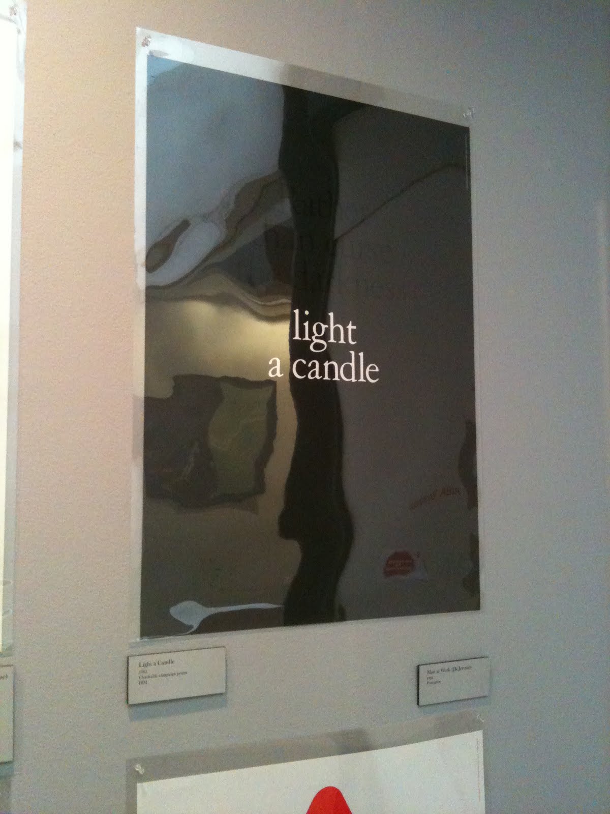
At first I thought, oh no... another graphic designer, but I actually found the exhibit quite enjoyable mainly due to large poster prints. A lot of his work has stood the test of time, or graphic design hasn't moved on that much ;) (at least its not "vintage/retro"). Seeing the prints up close really makes you appreciate the process by which they were made and also how technically skilled some of these artists/designers really were... there was no Illustrator or photoshop to edit>undo a mistake back then. I really, really, REALLY want to screenprint again soon.. seeing all these works (plus stuff at the Tate.. see further down) is teasing and taunting me...


As James put it, a lot of the pieces on display were more like ephemera rather than pieces of artwork, which was true... but thats the kinda stuff I actually like and want to put my own work on... simple things that can be seen by everyone, everywhere... but I love how something such as a logo can be placed on a myriad of different things.. (as seen in the 3rd photo below... a pin badge, keyring, bookmark, label etc)... I didn't actually take a photo of it, but there was also a large vinyl window sticker on display there which falls into the same category...


These are some of the other bits and pieces there that I liked for one reason or another.. be it process or just the idea behind them...


These are some of the other bits and pieces there that I liked for one reason or another.. be it process or just the idea behind them...


@ Carhartt (manchester)
I love this work for the recent Carhartt window display, I had planned on something VERY similar for my degree show back on my photography course... involving the idea that we take photographs of 3D objects which transcribes them into 2D but I wanted to turn them back into 3D. I found plenty of tutorials on how to do this via photoshop, made a few pairs of glasses and started playing with large images so the audience could maybe experience something else other than just looking at a photograph... but it was never meant to be and why I am now doing Illustration :)
anyway... removing half of the over complicated bullshit I planned to do, these displays simply have a pair of 3D (anaglyph) glasses stuck to the window infront of these large photographs/posters... I'm nothing but jealous... :) I want an excuse to use this technique again too!

anyway... removing half of the over complicated bullshit I planned to do, these displays simply have a pair of 3D (anaglyph) glasses stuck to the window infront of these large photographs/posters... I'm nothing but jealous... :) I want an excuse to use this technique again too!


In London:
first things first... I only know a few places to shop at in London, so if anyone has any other suggestions then fire away... but I ended up in my usual haunts whilst there... Magma, Kidrobot and Forbidden Planet.. but that doesnt mean I didnt do a little more wandering and investigating... found some moretoy urban vinyl shops, 2nd hand book shops and comic stores which all led to the purchase of some of these...
Lines that Wiggle, by Candace Whitman, illustrations by Steve Wilson.
first things first... I only know a few places to shop at in London, so if anyone has any other suggestions then fire away... but I ended up in my usual haunts whilst there... Magma, Kidrobot and Forbidden Planet.. but that doesnt mean I didnt do a little more wandering and investigating... found some more
Lines that Wiggle, by Candace Whitman, illustrations by Steve Wilson.
(i just tried finding a website for Wilson, but a lot of the work featured on the site looks NOTHING like the illustrations in this book, so I've left it off for now). I picked this up purely for its 'cute' quality and the characters featured in its pages. Described as a modern minimalist graphic art style, it appeals to my screenprint side and the humour within the work gives the impression that they enjoyed making it which in the end is what I need to remember to do.. have fun with what I'm creating... (also reminiscent to some of the other artists I enjoy looking at.. Tim Biskup and Adrian johnson for example...)


Poster Journeys by Abram Games & London Transport.
Unlike the majority of poster books I've picked up (and bought), this particular one doesnt just print the final images into a giant catalogue of work but instead shows some of Games' original sketches and roughs (unfortunately I havent had chance to scan any of these pages yet). It's not like I can learn how to be a better designer from looking at this prep work, but it helps seeing the creative process and how other people reach their final outcomes rather than just a glossy finished image. Normally I wouldn't have anything to do with London, but having spent a bit of time down there recently (due to my girlfriend living and studying down there at the moment), I feel like I understand the works a little deeper than just appreciating them on an aesthetic level.


Kidrobot
I can't help it... I end up buying something every time I go there... admittedly that's only twice so far, but it's not exactly cheap so it feels like I go there a lot... :( (just as bad as Magma!). Recently got...


Kidrobot
I can't help it... I end up buying something every time I go there... admittedly that's only twice so far, but it's not exactly cheap so it feels like I go there a lot... :( (just as bad as Magma!). Recently got...


FILE magazine.
stumbled upon this magazine in Magma (London) which isn't hard since its an oversized magazine, printed on newsprint at the size of a normal newspaper... I basically bought this as research for a personal collaboration project that I'm hoping will come to pass soon...

.jpeg)
.jpeg)
.jpeg)
.jpeg)
stumbled upon this magazine in Magma (London) which isn't hard since its an oversized magazine, printed on newsprint at the size of a normal newspaper... I basically bought this as research for a personal collaboration project that I'm hoping will come to pass soon...

.jpeg)
.jpeg)
... and to finish off....
I also bought both of these... Ben Newman t-shirts on sale at Tate Modern...


Very similar to the work of Jim Flora from the 50's but again, I bought these for their cute appeal, they make me want to screenprint and the humour.. especially on the Robot t-shirt :)
I also bought both of these... Ben Newman t-shirts on sale at Tate Modern...

Very similar to the work of Jim Flora from the 50's but again, I bought these for their cute appeal, they make me want to screenprint and the humour.. especially on the Robot t-shirt :)


