Thursday, 1 April 2010

Foto-Grafik

not my spelling but the tutors...

as a break from the hum drum of editorial briefs we were able to experiment with using photography within illustration. This started with simply drawing over some of my existing photos and trying find shapes within them too as the basis for creating characters...

Photobucket
Photobucket
Photobucket
Photobucket


apart from the last image, the others only run through once.. so either refresh or put up with it :P

I started by looking at some of my fave photographers and couldn't find a tangible link between the two subjects but looking at the work of jim Mahfood (see earlier post) I started to draw over my images and see what it made...

i was cutting out shapes in hopes that they would inspire some new character design but there was no solid theme behind them all... it was more about just me interpreting what I saw.

(pictures to follow)

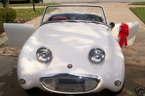
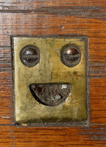
similarly I have used this blog before last year, FacesInPlaces, and i thought I could go out and try find faces within inanimate objects to then work from but this is getting a little over done now... cute ... but still over done plus theres no real illustration aspect to it...


D&AD Don't Panic

Rather than focusing on my main project, I was side tracked into finalising my design for the D&AD competition brief, in association with Don't Panic. I thought I was finished and all i needed to do was print it out for the deadline, but after some useful pointers and crit from Chris O and Ian my design got a bit of an overhauling to make sure it was up to par...

From my original screen printed maze idea...


I kept with the idea of not following the rules but wanted to include more humour and get some of my drawing in there...


I wanted to include this development work, just to show that drawing a simple character.. isnt all that simple. From my original sketch, I tweaked bits left, right and centre... and then flipped the design to make sure nothing else stood out as "wrong". Tracing paper is my new friend, I used so much of it during this project but it allowed me to produce multiple versions of my work...


I ended up vectoring the character but I was adamant about trying to get away from the computer. When I make anything on the computer it gets sapped of all its character and "feeling"... theres a certain kind of quality to hand made images that is lost. Yet, by printing out the vector onto some cheap paper and scrunching it up, it once again becomes hand made and has a character to it...


All of the above culminated into this final design, from hand drawn elements to digital vectors and scanned in textures to digital colour all combine to give the effect of a real children's colouring book...

After finalising the colours on my designs I went back and reworked my original maze so it all tied together better.


These have been packaged up, sent off and emailed to D&AD... so... it's out of my hands now...

it's strange thinking about how I started this project when compared to how I ended it, but this has probably been one piece of work that I am most proud of... purely because it feels like something I have made for myself, from my own influences and inspirations.


Sunday, 14 March 2010

Draw 160

http://drawn.ca/2010/03/12/draw-160/

things like this are what i need to concentrate on... ;)

Monday, 8 March 2010

photo brief

got a new photographic project coming up.. combining photography and illustration in some way... but I cant say im overly excited about this.. a) because we again will be having a week long deadline but mainly b) as I have lost nearly all love from photography and cameras in general... i left my photography course in order to pursue illustration... I remembered that I only took up photography as I didn't have confidence in my ability to draw what I wanted... taking a photo is like making a still life image of your subject, it will be accurate to life and universally readable to the viewer, whereas if you draw a still life...you(or me) would make mistakes or lack the skill to accurately portray the subject so that everyone would know/understand what it is...
(hope that is clear or at least slightly understandable...)

this is where I'm up to now though, I am lost within my own mind, not knowing what is me and what is just mimicking styles that I like... recently Ive not felt like anything ive created is my own... I dont feel like ive had any positive signs that im heading in the right direction... Im told by my peers that although I may be using a few different styles, there is something in each that is typically 'me'... but im failing to see this...

ah well, we shall see how the next couple of weeks go...

as soon as the photographic brief was introduced.. I immediately thought back to the Hansel&Gretel poster I did, looking at the work of Tomasz Boguslawski...


I also remembered the edited photographic work of Jim Mahfood or here


hmm.. it all seems too easy ... (interview) its the kind of approach Mark M has to his work...


editorial 2

im not going to do my usual ranting speech crap.. so i shall stop this sentence now..

recent work for editorial brief, based on victim/survivor stories and descriptions of their encounters..

tourettes:

avalanche:

frostbite (+colour variation)


contour drawn elements


I personally really enjoyed this one, purely because my ideas seemed easier to achieve via contour drawing. It was more enjoyable working this way rather than on the computer but my drawing seemed to be the main criticism ( as well as my colour choice)... but very little positive was said.. so I dont know if i have succeeded on some aspects and failed in others, or if its all a waste of time...

I turned to contour drawing for two reasons, one so I could remove any kind of over thinking on my behalf and second so I didn't worry about style or anything and could just create elements for the compositions...